About the Quality of Life Report
The 2019 Kansas City Quality of Life Survey was conducted in January 2019 among 1,000 randomly selected adults residing in the Kansas City area, defined for survey purposes as Johnson and Wyandotte counties in Kansas and Cass, Clay, Jackson and Platte counties in Missouri. The content is similar to 2018 survey, though not identical. Both were funded by the Ewing Marion Kauffman Foundation to better monitor quality of life issues in the Kansas City area. The Foundation contracted with the Mid-America Regional Council to bring this data to the community in a more accessible format so that residents, businesses, elected officials and other decision-makers could benefit from its content.
We hope this more interactive format for displaying data also allows for more social interaction as well. We want YOU to tell us what you find most interesting and important, and then share that insight with others. This will allow us to better target our analysis and presentations, as well as suggest areas for additional research.
The interactive graphics were developed in Tableau. A special thanks to Steve Wexler, whose email consultations and "Visualizing Survey Data" website helped MARC learn how to use Tableau to produce the interactive charts presented on this website. Of course, any errors in implementation remain the responsibility of MARC.
Using the Site
Each page provides one or more charts that display summary results and some introductory text highlighting a few key findings that can serve as signposts for your exploration. To start:
- Click on the drop-down menu labeled “Break Down by” and then select a demographic characteristic of interest, such as age, race, gender, employment status, education, income or county of residence.
- Once a characteristic is selected, the chart will expand to show how the survey responses vary by demographic group. These breakdowns allow you to see the rich diversity of quality-of-life perceptions held by the region’s residents.
Visualizations — Homing in on the Data
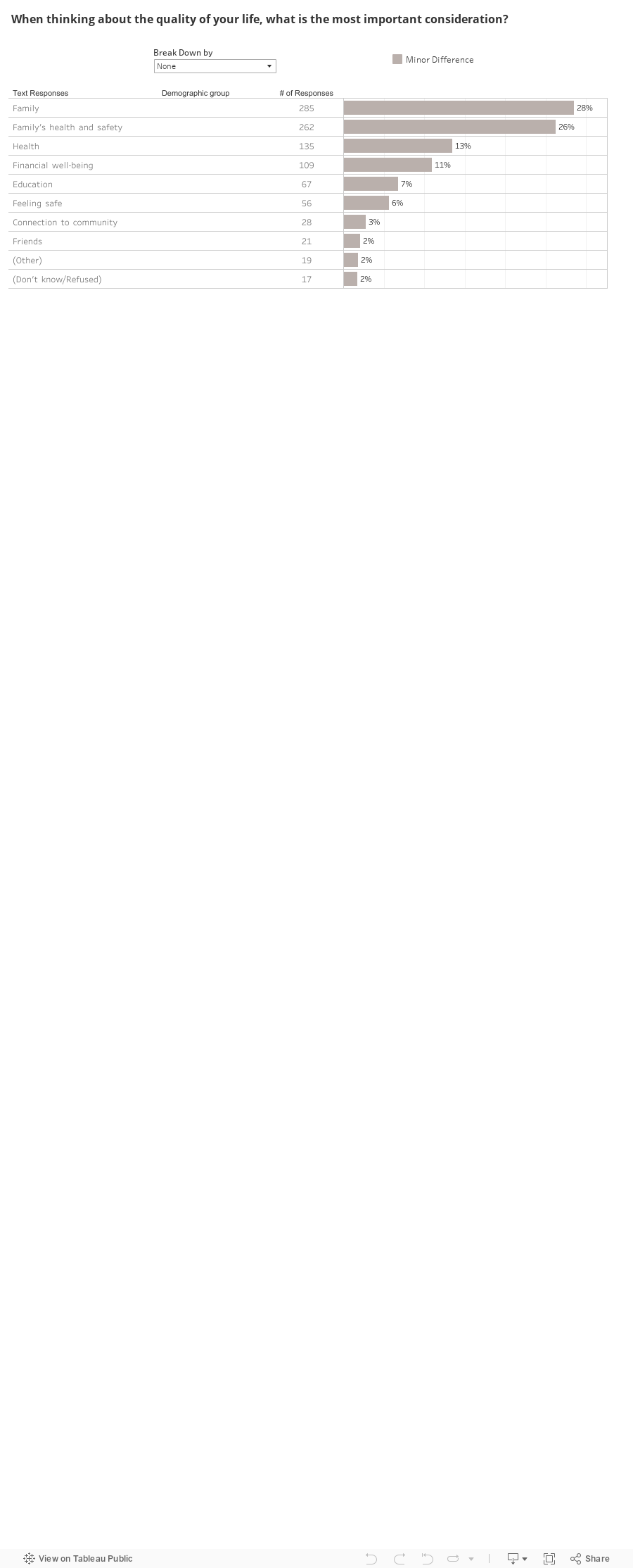
Some questions ask residents to select from a set of options, such as which of the eight considerations provided are most important to your quality of life, or which of the 11 community issues is most important. When each potential choice is then broken down by demographic groups that themselves may have up to seven segments, the number of responses can be a little overwhelming. (Click on “Drop Down by” and select “Age group” in the visualization below, for example.)
We provide a few ways to help you focus on what is important. First, if there is at least a 10 percentage point difference between one demographic segment (say, adults aged 35-44) and another (say, adults aged 65+), then we display the demographic segments with largest difference in a different color. Second, if you click on the text describing the choice (for example, “Family's health and safety”), the data for that choice is highlighted and the data for the other choices is grayed out, visually emphasizing your choice. Finally, if you click on a color in the chart legend, the choices corresponding to that color will be similarly highlighted and the rest grayed out.